
UX Writing
Small words matter and every character space counts. Well-crafted UX writing improves usability, reduces confusion, and ensures that users can easily understand and navigate a product.
As a UX writing lead, I support design teams and content writers with UX writing guidelines to ensure a smooth and consistent user experience.
The voice that defines
user experience
What is UX writing?
UX writing is the the art of creating clear, concise, and useful text that helps users navigate and accomplish their goals.
UX writing includes every word users encounter while using a website, app, or digital product - from button labels to error messages, from form fields to confirmation emails.
Think of UX writing as the conversation between your product and your users.

Common issues with poor UX writing
Inconsistent terminology
Using different terms for the same feature or action
Mixing formal and informal language arbitrarily
Inconsistent capitalization and formatting
Varying voice and tone across similar interactions
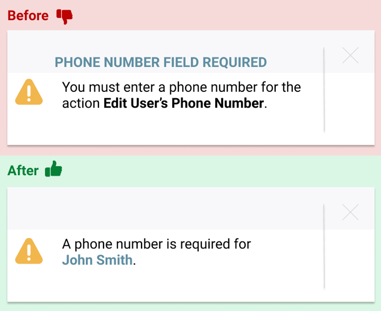
Unclear error messages
Providing vague or unhelpful error descriptions
Missing clear next steps for resolution
Using technical error codes without explanation
Blaming users instead of offering solutions
Tone of voice issues
Shifting between formal and casual tones
Mixing brand voices across features
Inconsistent personality in messaging
Conflicting emotional tones
Lack of empathy or failing to acknowledge user frustrations or offer a solution
Over explaining
Using internal terminology in user-facing content
Failing to translate complex concepts into plain language
Assuming users understand technical terms
Including unnecessary technical details
Including unnecessary context
Poor UX writing significantly undermines product usability and user trust, creating friction points that can lead to abandoned transactions, increased support costs, and damaged brand perception.
Common issues from poor UX writing include:
Solutions for better UX writing
Consistent terminology
Create and maintain a detailed content dictionary
Document approved terms and variations
Establish clear naming conventions for features
Build automated checks for terminology consistency
Review content regularly for term alignment Train teams on terminology standards
Productive error messages
Lead with the solution, not the problem Use clear, actionable language
Explain what happened in simple terms
Provide specific next steps Include helpful links or resources
Test error messages with users
Use consistent error message patterns
Defined tone of voice
Document clear tone of voice guidelines
Create example banks for different scenarios
Show how tone shifts for different contexts
Provide writing templates and frameworks
Include both good and bad examples
Tone of voice collaboration / training
Conduct copy audits across touchpoints
Concise messaging
Create plain language alternatives
Define when technical terms are necessary
Practice word economy on interfaces
Break complex concepts into simple steps
Use analogies and examples when helpful
Test comprehension with target users
Create standard translations for common technical terms
Implement accessibility best practices
Good UX writing is a cornerstone of exceptional user experience (UX). It’s not just about crafting grammatically correct sentences; it’s about communicating clearly, concisely, and empathetically with users to guide them through their journey with ease
Components of quality UX writing include:
UX writing style guides
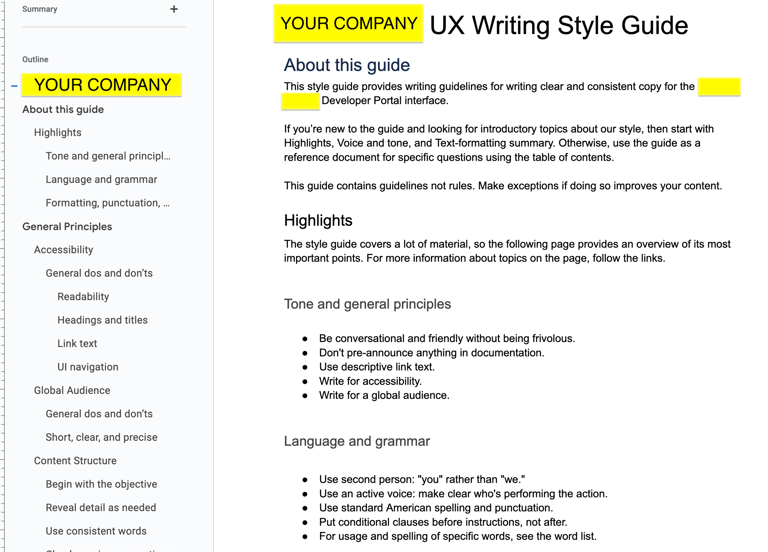
A UX Writing Style Guide is an essential tool for creating and maintaining high-quality, consistent, and effective UX copy. It serves as a comprehensive reference document that outlines the rules, principles, and best practices for writing content in a user interface (UI).
Does your UX design team use a branded UX Writing Style Guide?
A style guide helps ensure that the copy is aligned with the brand voice, user needs, and product goals, and it provides clarity on how to approach various content scenarios.
Improves collaboration between teams

Promotes accessibility and inclusivity
Importance: A UX Writing Style Guide fosters collaboration by ensuring that everyone—designers, developers, marketers, and product managers—understands the language guidelines and can contribute to the product’s copy.
Benefit: When all team members are on the same page about language and tone, communication improves, and content is better integrated into the design, product features, and user flows.
Example: Designers may reference the guide to ensure button labels match the tone of the overall interface, while developers can ensure the copy works well with technical limitations (e.g., text length for mobile screens).
Importance: A style guide can establish rules for creating accessible content that caters to users with different needs, such as those with cognitive disabilities or non-native speakers.
Benefit: Clear, simple language and guidelines for writing for accessibility ensure that the copy is inclusive and usable by a wider audience, improving user experience for people with disabilities or those who don’t speak the primary language fluently.
Example: A style guide might include recommendations for avoiding jargon or providing clear instructions for form fields, which helps users with cognitive disabilities or those using screen readers.

Voice and tone
Establish brand identity and consistency
Without a consistent voice and thoughtful tone, users might feel disoriented or confused, reducing trust in the product
Maintain a human connection
In a world of automated and impersonal digital interactions, human-centric voice and tone help products feel more relatable and trustworthy.
Improve accessibility and inclusivity
A considerate voice and inclusive tone broaden the reach of the product, making it usable by a larger, more diverse group of people. This is particularly important in products targeting international markets or those in healthcare, education, and finance.
Guide user behavior and build trust
A friendly but professional tone can boost user confidence, especially in situations where the user is unsure or navigating a new experience. Trust is essential for user adoption and retention, particularly in sensitive areas like banking, healthcare, and e-commerce.
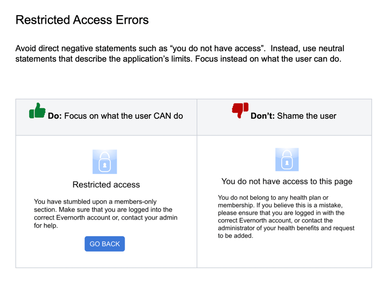

The voice and tone of UX writing are critical elements in shaping the user's experience and perception of a product. Together, they dictate how users interact with a product, how they feel during these interactions, and whether they trust the brand.
Controlled vocabularies
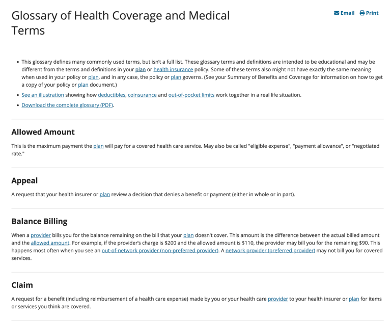
Controlled vocabularies are an essential part of UX writing because they help ensure consistency, clarity, and usability across digital products.
A controlled vocabulary is a predefined set of terms, phrases, and language used consistently within a product or service.
A controlled vocabulary in UX writing isn’t just about choosing the right words—it’s about crafting a language system that fosters clarity, consistency, and a better overall experience for users.
By using a controlled set of terms and ensuring that everyone involved in creating the user experience is on the same page, companies can improve usability, accessibility, and satisfaction, ultimately leading to a more successful product.
How to implement controlled vocabularies
Document the Vocabulary: Create a style guide or glossary that defines each term and its usage. This should include definitions, preferred spellings, and examples of when to use each term.
Incorporate User Feedback: Continually assess the language used in your product by gathering feedback from users. The controlled vocabulary should be flexible enough to adapt based on real-world usage.
Collaborate with Cross-Functional Teams: Involve designers, developers, and product managers in defining and adhering to the controlled vocabulary. This ensures that the vocabulary meets the needs of all parts of the product.
Regularly Update: As products evolve, so too should the controlled vocabulary. Regularly review and revise the language to ensure that it remains relevant and effective.
My approach to UX writing
Less is more
Simple doesn't happen automatically. The majority of time I focus on ways to minimize UX copy—getting the most clarity and impact with as few words as possible.
Clarity and simplicity
Use plain, straightforward language
Remove unnecessary words and complexity
Make information scannable and digestible
Present one clear message at a time
User-centered focus
Write from the user's perspective
Address user needs and goals
Anticipate questions and concerns
Provide relevant context
Consistency & standards
Maintain consistent terminology
Follow established style guidelines
Use predictable patterns
Ensure brand alignment
Action-oriented communication
Provide clear next steps
Use strong, specific calls to action
Make outcomes explicit
Guide users confidently
Empathy & context
Write with emotional intelligence
Consider user state of mind
Provide reassurance when needed
Acknowledge user effort and time
Accessibility & inclusivity
Write for all ability levels
Use inclusive language
Support internationalization
Consider cultural context
Efficiency & purpose
Every word serves a function
Content is concise and necessary
Information appears at right time
Support task completion
Testing & iteration
Validate content with users
Measure effectiveness
Gather feedback
Continuously improve


Ready for a professional UX writer?
Let's discuss how I can create more effective, user-centered content that drives results.


